Get a quote from us within 24 hours. Call us at  +63917 712 8496 or


We understand that there are times you have your own SEO team and all you need is guidance with how you should structure your on-site optimization, or how to execute your off-site optimization efforts. You don’t want to spend more money than necessary hiring an SEO company full-time. This is the right package for you.
Learn More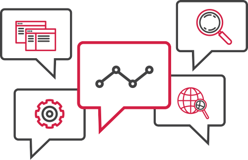
 (69) Google Review
You have a website and you don’t know the first step to making it rank or you don’t have the time to execute on SEO strategies that you are familiar with – this is the package for you. Our SEO services are completely comprehensive and end-to-end.
This includes:
On-site optimization – Meta data optimization, schema tags optimization, SEO copywriting, strategic internal linking, outbound links control, all the way up to basic site speed optimization, we got you covered.
Off-site optimization – Link building using strategies like guest posting, broken link building, link reclamation, creative link building campaigns, paid directory listing, local search optimization, positive social signals, content marketing, all the way to co-citation – we do it all.
Learn More
Every second that your site fails to load is a second of opportunity loss. Facebook is just one click away and it loads extremely fast so you better make sure that your site gives users what they want before they click some other site.
On top of that, site speed is a ranking factor. As to how much it affects your site’s SEO, let’s just say it’s very significant. Our site speed optimization service makes sure that your site loads extremely fast, is a pleasure to browse through, and ranks well with search engines.
Don’t believe it? Check out our Ultimate Guide to Site Speed Optimization if you want to try to do it on your own.
Learn More
There are few things that can hurt your site’s rankings more than security vulnerabilities. Once your site gets compromised and it gets defaced, shut down, DDOS attacked, or injected with malware, your search rankings will go down like a plane with its engines on fire.
With our site security optimization package, we harden your website’s security to the point where it is impenetrable. If that doesn’t sound too convincing, we also have an active clean-up process where we can track and clean any and all form of malware injected in your site.
Our site security optimization package is a very holistic approach to site security to make sure your rankings stay where they are after we have optimized them.
Learn More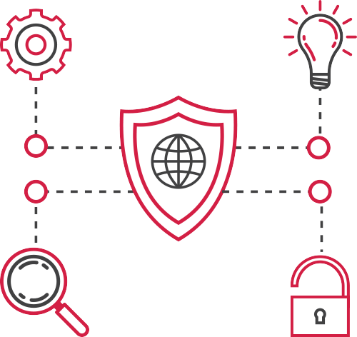
Let’s just say that you’re able to exhaust all possible traffic you can get from SEO, what then? What comes after perfecting search traffic?
The simple answer is, increase your conversion rates. Your website’s goal is to convert a passing visitor to a qualified lead or customer. Our conversion rate optimization services ensure just that. We study your business, your website, and your site’s users then hypothesize tests and execute them to crank up your site’s conversion rates.
Conversion Rate Optimization also affects SEO in such a way that it increases user activity and lowers bounce rate and pogo-sticking indefinitely. However, it’s important to note that our Conversion Rate Optimization services play perfectly well with our Search Engine Optimization services because of our expertise on both. One service will not damage another – in fact, it will compliment each other in the sense that you get the maximum amount of search traffic and the maximum amount of conversions.
Learn More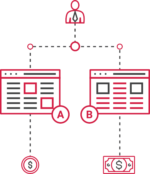
Clients are assisted by awesome search engine optimization strategists.
Their single focus is to not only make you rank, but to increase your company's revenue.
GGB Building, Pascor Drive Parañaque City, Metro Manila
10 Wilson St. Greenhills West, San Juan City, Metro Manila 1502 Philippines
Unit AD, 11th Floor 8 Rockwell Hidalgo Drive, Rockwell Center Makati City
389 Real St. Padre Diego Cera, Pulanglupa, Las Pinas City
Civic Prime Building, 2501 Civic Drive, Filinvest Corporate City, Alabang, Muntinlupa City, 1780 Philippines

275 Santolan Road San Juan
1384 Jose Abad Santos Avenue, Tondo, Manila

6A Dama De Noche Street, UPS 4 Compound, Sucat, Paranaque City

20th Floor Unit 2016 AIC Burgundy Empire Tower, ADB Avenue cor. Sapphire road, San Antonio, Pasig City
Blk. 2, Lot 14, Avanti St., Sterling Industrial Park, Barrio Iba, Meycauayan, Bulacan
747 Dir. A. Bunye St., Purok 5, Barangay Sucat, Muntinlupa
12 Tagdalit Street, Brgy. Manresa, Quezon City

24B 11th Jamboree St. Tomas Morato, Quezon City
Don Paquito Bldg. 99 Dasmarinas St. Binondo, Manila, Philippines

2nd Flr. FRS Bldg., #497 Brgy. Manresa, Del Monte Avenue, Quezon City, Philippines 1115

3F C&C business Center, Aguirre Ave, Parañaque, 1720 Metro Manila
31 General Malvar St., Brgy Bagong Barrio, Caloocan City
577 F. Dulalia St Lingunan Valenzuela City

4F Annex A, Lucky Chinatown Mall, Reina Regente St., Binondo, Manila

4/F FMCB Center, #68 Jupiter St. Bel-Air, Makati City

Lot 11, Blk. 1B, Meridian Ave., Meridian Industrial Park, Brgy. Macabling, Sta. Rosa Laguna 4026

Calderon Bldg. #827 Edsa South Triangle Diliman Quezon City 1103
Main Showroom: Phase 2, Block 3, Lot 5, Paseo De Magallanes South Luzon Expressway, Makati City 1232 Metro Manila, Philippines

Km 15 West Service Road, South Super Highway, Barangay Sun Valley, Paranaque, Metro Manila
78-D F. Blumentritt Street, Brgy. Kabayanan San Juan City, Metro Manila
2269 A.Luna, Pasay, 1300 Metro Manila
Tri-Ax One Center, 133 M. Almeda Street, Pateros, Metro Manila
2253 Aurora Blvd., Pasay City, Philippines

J. Cruz St. Brgy. Ugong, Pasig City, Metro Manila, Philippines 1604

5 Harmony St., Grace Village, Quezon City, Quezon City, Metro Manila

Unit 607, Tower 3, Enterprise Square Phase 1, 9 Sheung Yeut Road, Kowloon Bay, Kowloon, HK

RGC Compund Canlubang Industrial Estate, Brgy. Pittland, Cabuyao, 4025 Laguna

2F NEX Tower 6786 Ayala Avenue Makati City

17F Robinsons Summit Center, 6783 Ayala Avenue, Makati City, 1226 Philippines

1232 United Nations Ave., Paco Manila

6th Floor SM MAAX Building. Mall of Asia Arena Annex Bldg, Coral Way cor. J.W. DioknoBlvd., MOA Complex, Pasay City

2320 Pasong Tamo Ext. (Chino Roces Extension) Makati City, 1200 Philippines
Barrio Perez, Meycauayan, Bulacan

33 Maj. Santos Dizon St, Marikina, 1800 Metro Manila
Manga Ave, Cubao, Quezon City, Metro Manila

7899 Makati Avenue, Makati City, Metro Manila, Philippines

World Trade Center Metro Manila Mezzanine Level WTCMM Building, Sen. Gil J. Puyat Ave. cor. Diosdado Macapagal Blvd., Pasay City 1300

280 North Old Woodward Ave. Suite 210 Birmingham MI 48009,USA

4th Floor The West Wing Building, 107 West Ave, Quezon City, 1105 Metro Manila

Quezon City, Metro Manila
1402 Centerpoint Bldg., Garnet Road, Ortigas Center,Pasig City, Metro Manila Philippines
BF Homes, Paranaque, Metro Manila
Dan Gravel & Sand Supply, 5 Paz, 083, Caloocan, Metro Manila
2200 Jesus St, Pandacan, Manila, 1011 Metro Manila

Washington ave, Miami, FL, United States, Florida
LRI Design Plaza, 210 N. Garcia St., Bel-Air II, Makati

NAC Tower, 32nd Street Bonifacio Global City Taguig City 1634, Metro Manila, Philippines
Machuca Tile, 867 Gen. Solano St., San Miguel, Manila, Metro Manila, Philippines 1005

545 Caballeros St, Binondo, Manila, 1006 Metro Manila

Francis Kong is arguably the most respected motivational speaker in the Philippines who has an extensive work experience in manufacturing and retail. He founded a popular clothing company and ran a retail chain for many years. Last year, he delivered 336 talks, training sessions, and seminars both here and abroad.
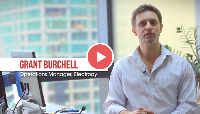
Electrodry is a carpet cleaning company in Australia. They are one of the first large Australian cleaning franchises with over 140 franchisees all over the country. Electrodry is the only professional carpet cleaning company endorsed by the National Asthma Council of Australia’s Sensitive Choice program.
Finding the right SEO company in the Philippines is crucial if you want to rank higher than your competitors. Digital marketing is a cutthroat industry. You certainly don’t want to lag behind by using outdated SEO techniques that are not only ineffective, but that also hurts your business in ways that you could’ve avoided in the first place.
To get started, you need to put your trust in an SEO company that can really do all kinds of exceptional SEO work for you; from on-page SEO, link building, technical SEO, core web vitals, and other SEO disciplines and processes. The good news is, you don’t have to look further. SEO Hacker is the SEO company of choice in the Philippines. You can put your trust in our team to do the work for you.
If you’re a business owner and you’re not convinced yet that your business needs SEO, here’s one simple reason - we can grow your business in ways you’ve never seen before.
In this digital age, your online presence matters and SEO Hacker has the right tools to help you rise up the ranks. With our SEO practices, we can guarantee that your business will not regret anything. Want your website to rank number one on Google? Want to gain more search traffic? How about generating more sales and improving your conversion rate? SEO Hacker will make all of this happen for you.
As an SEO company in the Philippines we have an obligation to tell you how our services work. Granted, it may seem like magic, but there are plenty of technical factors in play when it comes to ranking your website: user experience, loading speeds, content quality, and many more.
Simply put, SEO or Search Engine Optimization is a kind of digital marketing strategy that’s dedicated to improving your presence in search engines such as Google or Bing. SEO uses a wide variety of on-page and off-page techniques that are designed to make your website rank higher.
The idea is to get your website to become more site and user-friendly to “search engine crawlers.” The job of these crawlers is to essentially analyze and obtain data from the content of different websites. Then, they index these websites according to the most relevant ones.
For example, if you Google search the keyword “SEO company Philippines,” it will give you a list of the top 10 companies that provide SEO services. It’s likely that we’re on that list, if not at the number one spot.
Not all SEO companies are built the same. The thing that separates SEO Hacker from the rest of the pack is that we don’t make any outrageous promises that we can’t deliver on.
All of our methods and processes offer you only clean, no-frills results that you’ll be able to see for yourself. Unlike other companies, we make sure that your website doesn’t get penalized by any search engine. This is because we use only ethical, white hat SEO techniques like keyword research and analysis, link building, backlinking, content writing, and the like.
Here at SEO Hacker, we have our clients’ best interests at heart. Everything we do in our company has been the result of several years of innovation and experimentation that we have successfully tailor-fitted to each of our client’s needs. We’re constantly updating ourselves on the latest SEO news and trends to ensure that we’re working on only the most crucial ranking factors for your website.
 ?
?Just like you, we understand the importance of digital marketing. From our humble beginnings, we have eventually become a full-fledged SEO company in the Philippines that knows the ins and outs of the industry.
SEO Hacker has been working to provide top-notch SEO services for more than 10 years now. SEO is a constantly changing landscape, which is why there is always a need to adapt. Our more than a decade's worth of experience means we have witnessed some of the major core updates of the Google search engine. These updates have defined SEO as we know it today and the SEO that we have been offering our clients.
With us, you’ll get nothing but premier SEO services that you won’t find elsewhere. While we have been doing time-tested SEO, we also make sure to discover and master the latest white hat SEO techniques and strategies that focus on the important ranking factors for your website.
We can improve any aspect of your website, making sure that it doesn’t get penalized in the process. We can boost your site’s loading time, improve the UI, and optimize it for mobile devices. More than that, we’re also consistently churning out relevant and trustworthy content. You’ll have the opportunity to not only exponentially grow your website traffic, but also convert your website into a revenue-generating machine that works even during your idle time.
All of this is made possible with the knowledge and expertise of our in-house team. We do not outsource our services, so you can be sure that you’re working with people who really know their SEO. From our account managers down to our link builders, blog managers, specialists, and web developers, our homegrown team is equipped to give you premium-quality SEO that has been honed for many years.
Here at SEO Hacker, we curate our strategies depending on those that can provide your website with genuine, observable results that no other SEO company in the Philippines can do for you. With that in mind, the services that we’ll provide you are the result of only honest and ethical strategies when it comes to on-page SEO, content writing, and link building.

As the name suggests, on-page SEO is all about optimizing your website so that it will rank higher in the SERPs (search engine results pages). It can also gain you more visitors or traffic. Unlike off-page SEO, which focuses on external factors such as links, social networking, or content marketing, on-page focuses on your website and its content. This strategy helps your site get aligned with Google’s E-A-T metrics (expertise, authoritativeness, and trustworthiness).
Our on-page SEO is all about improving your visitors’ experience on your website. We employ these strategies to create SEO-friendly headlines, titles, meta descriptions, headers, images, and other kinds of HTML tags.

As an SEO company in the Philippines, SEO Hacker understands the value of content for your website, which is why our extremely talented writers know just the kind of blog posts and landing page content that your website needs.
Typically, we publish 4 relevant, timely, and comprehensive blog posts for our clients every month. We use only the most competitive keywords to write meaningful content that will arguably best all the other blog posts that other people will find on Google.
With content that is consistently published at a regular interval, your website can easily improve its organic click-through-rate (CTR) which can bring a great return on investment for your organization.
Apart from on-site blogging, we also conduct regular guest posting. Guest posting allows us to generate good backlinks and inbound links for your website. This in turn allows you to boost your site’s organic ranking, achieve faster indexing, and gain more referral links.

Our SEO company in the Philippines also has a dedicated team of link builders whose job is to find other websites that want to link to yours. As mentioned before, search engine crawlers scan every piece of content in your site — even the links between websites. These crawlers and bots use the links as a way to gauge how well your website ranks in the results pages.
Think of link building in this way: the more people that vouch for you, the better your chances are of landing your dream job. In SEO terms, the more quality links from authoritative websites that you have on your page, the higher your ranking will be.
Do you want to see your website on the first page of Google? No problem, SEO Hacker has you covered.
We have been dabbling with SEO since way back in 2010. This was during the so-called “new age” where Google introduced myriads of algorithm updates that resulted in tons of websites being penalized. This was because they were manipulating some of the ranking factors.
Eleven years later (and counting), our company still prides itself on never having gone against the way Google works. Our clients can attest to that.
Here at SEO Hacker, we have a vast range of clientele under our belt—both small-scale businesses and full-scale corporations, both local companies and international ones. Whoever our client is, we only do what we excel in—that is, we only do our best.
As mentioned, we also ensure that we never compromise our clients’ branding. All of our strategies and means are legal and will never violate Google’s guidelines. With us, you do not have to fret that your site will suddenly go down or will be penalized by Google.
That being said, we do not promise that your site will be on the first page overnight, or in a few weeks, for that matter. In fact, you should be wary of those who make such outrageous claims—after all, miracles do not happen in SEO. At SEO Hacker, we perform every single action manually, from writing the blog posts to building links, which means that it may take us a bit longer (typically 6 months) to rank on the first page of Google.
But the thing is, once we land in that coveted spot, we stay there for good.
Aside from setting realistic expectations, our team is also all about transparency. We will never hide anything from you. Everything we do is listed down in a comprehensive report that we relay to you every month.
Lastly, we are a company that does not need supervision. You do not have to worry about us badgering you with calls every minute about what needs to be done. All you need to do is put your complete trust in us, relax, and witness your site make its way to the first page of Google.
Do you want your website to be topnotch, from web design to layout to content? Do you want to lure in more visitors, convert the users to customers, and eventually usher in sales? Click here to learn more about our packages and the services we offer.
The SEO Hacker team is eager to work with you.